NCERT Solutions for Class 8 Maths Chapter 15: Introduction to Graphs
Download the free PDF of NCERT Solutions for Class 8 Maths Chapter 15, Introduction to Graphs, which is crucial for fostering logical and mental skills in students. Crafted by subject experts in accordance with the latest CBSE Class 8 Syllabus, these exercise-specific solutions aid students in assignments and exam preparation for the academic year 2023-24. Regular practice of Class 7 NCERT Maths Solutions is recommended to enhance problem-solving abilities, facilitating high marks in examinations.
Access Answers to NCERT Solutions for Class 8 Maths Chapter 15: Introduction to Graphs
Students can access the NCERT Solutions for Class 8 Maths Chapter 15: Introduction to Graphs. Curated by experts according to the CBSE syllabus for 2023–2024, these step-by-step solutions make Maths much easier to understand and learn for the students. These solutions can be used in practice by students to attain skills in solving problems, reinforce important learning objectives, and be well-prepared for tests.
Exercise 15.1
For an experiment in Botany, two different plants, plant A and plant B, were grown under similar laboratory conditions. Their heights were measured at the end of each week for 3 weeks. The results are shown by the following graph.
(a) How high was Plant A after (i) 2 weeks (ii) 3 weeks?
(b) How high was Plant B after (i) 2 weeks (ii) 3 weeks?
(c) How much did Plant A grow during the 3rd week?
(d) How much did Plant B grow from the end of the 2nd week to the end of the 3rd week?
(e) During which week did Plant A grow most?
(f) During which week did Plant B grow least?
(g) Were the two plants of the same height during any week shown here? Specify.
(a) (i) Plant A was 7 cm high after 2 weeks.
(ii) After 3 weeks, it was 9 cm high.
(b) (i) Plant B was also 7 cm high after 2 weeks.
(ii) After 3 weeks, it was 10 cm high.
(c) Plant A grew=9 cm–7 cm = 2 cm during 3rd week
(d) Plant B grew from end of the 2nd week to the end of the 3rdweek = 10cm–7cm= 3cm
(e) Plant A grew the highest during the second week.
(f) Plant B grew the least during first week.
(g) Yes. At the end of the second week, plants A and B were of the same height, which is 7 cm.
The following line graph shows the yearly sales figures for a manufacturing company.
(a) What were the sales in (i) 2002 (ii) 2006?
(b) What were the sales in (i) 2003 (ii) 2005?
(c) Compute the difference between the sales in 2002 and 2006.
(d) In which year was there the greatest difference between the sales as compared to the previous year?
(a) The sales in
(i) 2002 was Rs. 4 crores and (ii) 2006 was Rs. 8 crores
(b) The sales in
(i) 2003 was Rs. 7 crores and (ii) 2005 was Rs. 10 crores.
(c) The difference of sales in 2002 and 2006 = Rs. 8 crores–Rs. 4 crores= Rs. 4 crores
(d) In the year 2005, there was the greatest difference between the sales, and compared to its previous year, which is (Rs. 10 crores –Rs. 6 crores) = Rs. 4 crores
A courier person cycles from a town to a neighboring suburban area to deliver a parcel to a merchant. His distance from the town at different times is shown by the following graph.
(a) What is the scale taken for the time axis?
(b) How much time did the person take for the travel?
(c) How far is the place of the merchant from the town?
(d) Did the person stop on his way? Explain.
(e) During which period did he ride fastest?
(a) 4 units = 1 hour
(b) The person took 3 ½ hours for the travel.
(c) It was 22 km far from the town.
(d) Yes, this has been indicated by the horizontal part of the graph. He stayed from 10 a.m. to 10.30 a.m.
(e) He rides the fastest between 8 a.m. and 9 a.m.
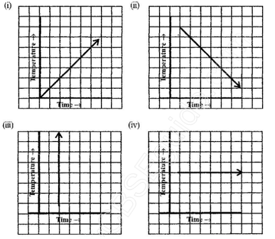
Can there be a time-temperature graph as follows? Justify your answer.

(i) It is a time-temperature graph. It is showing the increase in temperature as time increases.
(ii) It is a time-temperature graph. It is showing the decrease in temperature as time increases.
(iii) The graph figure (iii) is not possible since the temperature is increasing very rapidly, which is not possible.
(iv) It is a time-temperature graph. It is showing constant temperature.
The following graph shows the temperature forecast and the actual temperature for each day of the week.
(a) On which days was the forecast temperature the same as the actual temperature?
(b) What was the maximum forecast temperature during the week?
(c) What was the minimum actual temperature during the week?
(d) On which day did the actual temperature differ the most from the forecast temperature?
(a) On Tuesday, Friday and Sunday, the forecast temperature was same as the actual temperature.
(b) The maximum forecast temperature was 35oC.
(c) The minimum actual temperature was 15oC.
(d) The actual temperature differed the most from the forecast temperature on Thursday.
The following graph shows the temperature of a patient in a hospital, recorded every hour.
(a) What was the patient’s temperature at 1 p.m.?
(b) When was the patient’s temperature 38.5° C?
(c) The patient’s temperature was the same two times during the period given. What were these two times?
(d) What was the temperature at 1.30 p.m.? How did you arrive at your answer?
(e) During which periods did the patient’s temperature show an upward trend?
(a) The patient’s temperature was 36.5oC at 1 p.m.
(b) The patient’s temperature was 38.5oC at 12 noon.
(c) The patient’s temperature was same at 1 p.m. and 2p.m
(d) The temperature at 1.30 p.m. is 36.5oC.
The point between 1p.m.and 2 p.m., the x-axis is equidistant from the two points showing 1 p.m. and 2 p.m. So, it represents 1.30 p.m. Similarly, the point on the y-axis, between 360 C and 370 C, represents 36.50 C.
(e) The patient’s temperature showed an upward trend from 9 a.m. to 11 a.m. and from 2 p.m. to 3 p.m.
Use the tables below to draw linear graphs
(a) The number of days a hillside city received snow in different years.
(b) Population (in thousands) of men and women in a village in different years.
(a) Consider “Years” along the x-axis and “Days” along the y-axis. Using the given information, the linear graph will look like this:
(b) Consider “Years” along the x-axis and “No. of Men and No. of Women” along the y-axis (2 graphs). Using the given information, the linear graph will look like this:
Exercise 15.2
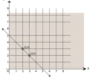
Draw the line passing through (2,3)and(3,2). Find the coordinates of the points at which this line meets the x-axis and y-axis.
Graph for the line passes through points (2, 3) and (3, 2) is
The coordinates of the points at which this line meets the x-axis at (5, 0) and Y axis at (0,5).

Write the coordinates of the vertices of each of these adjoining figures.
We can observe three figures named as, OABC, PQRS and LMK.
Vertices of figure OABC
O (0, 0), A (2, 0), B (2, 3) and C (0, 3)
Vertices of figure PQRS
P (4, 3), Q (6, 1), R (6, 5) and S (4, 7)
Vertices of figure LMK
L (7, 7), M(10, 8) and K(10,5)
State whether True or False. Correct those that are False.
(i) A point whose x-coordinate is zero and y-coordinate is non-zero will lie on the y-axis.
(ii) A point whose y-coordinate is zero and x-coordinate is 5 will lie on the y-axis.
(iii) The coordinates of the origin are (0, 0).
i) True.
ii) False; it will lie on the x-axis.
(iii) True.
Plot the following points on a graph sheet. Verify if they lie on a line
(a) A(4,0), B(4, 2),C(4,6), D(4, 2.5)
(b) P(1, 1), Q(2, 2), R(3,3), S(4, 4)
(c) K(2, 3), L(5, 3), M(5,5), N(2, 5)
Plot all the points on the graph.
(a) All points, A, B, C and D, lie on a vertical line.
(b) P,Q, R and S points also make a line. It verifies that these points lie on a line.
(c) Points K, L, M and N. These points do not lie in a straight line.
Exercise 15.3
Draw a graph for the following.
(i) Yes, it is a linear graph.
(ii) No, it is not a linear graph because the graph does not provide a straight line.
Draw the graphs for the following tables of values, with suitable scales on the axes.
(a) Cost of apples.
(b) Distance travelled by car.
(i) How much distance did the car cover during the period 7.30 a.m. to 8 a.m.?
(ii) What was the time when the car had covered a distance of 100 km since its start?
(c) Interest on deposits for a year.
(i) Does the graph pass through the origin?
(ii) Use the graph to find the interest on Rs 2500 for a year.
(iii) To get an interest of Rs. 280 per year, how much money should be deposited?
Mark “number of apples” on the x-axis and “cost” on the y-axis. The graph is
(b) Represent the “time” on the x-axis and “distance” on the y-axis.
(i) The car covered a distance of 20 km.
(ii) It was 7.30 am, when it covered a distance of 100 km.
(c) Represent “Deposit” on the y-axis and “simple interest” on the x-axis.
(i) Yes, the graph passes through the origin.
(ii) Interest on Rs. 2500 is Rs. 200 for a year.
(iii) Rs. 3500 should be deposited for the interest of Rs. 280.
Frequently Asked Questions
The NCERT solution for class 8 Chapter 15: Introduction to Graphs is important as it provides a structured approach to learning, ensuring that students develop a strong understanding of foundational concepts early in their academic journey. By mastering these basics, students can build confidence and readiness for tacking more difficult concepts in their further education
Yes, the NCERT solution for class 8 Chapter 15: Introduction to Graphs is quite useful for students in preparing for their exams. The solutions are simple, clear, and concise allowing students to understand them better. Introduction to Graphs ally, they can solve the practice questions and exercises that allow them to get exam-ready in no time.
You can get all the NCERT solutions for class 8 Maths Chapter 15 from the official website of the Orchids International School. These solutions are tailored by subject matter experts and are very easy to understand.
Yes, students must practice all the questions provided in the NCERT solution for class 8 Maths Chapter 15 : Introduction to Graphs as it will help them gain a comprehensive understanding of the concept, identify their weak areas, and strengthen their preparation.
Students can utilize the NCERT solution for class 8 Maths Chapter 15 effectively by practicing the solutions regularly. Solve the exercises and practice questions given in the solution. Also, you can make Introduction to Graphs al notes and jot down the important concepts for your understanding.

