
Bar Graphs for Class 4 [+12 Practice Worksheets]
This is a comprehensive lesson plan for teaching bar graphs to grade 4 students. The lesson is designed to make the concepts easy and engage students with activities like quizzes, practice questions, worksheets, visual aids like images and videos, and real-life examples.
Teachers can use this guide as a reference for delivering the concepts to students and engaging them in the classroom with the various questions and examples given in this page.
For parents, there are 12 downloadable practice worksheets that they can use for their kids.
In this article, you will learn:
- What is a bar graph and its properties
- Types of bar graphs
- Steps to draw a bar graph
- Interpretation of bar graphs
What is a Bar Graph?
- Bar graph is the graphical representation of the set of data.
- It is rectangular bar of equal width and the height of the bar is proportional to the value of data they represent.
- It has two lines, one horizontal line and one vertical line.
- The horizontal line represents the data type or the data categories.
- The vertical line represents the data value.
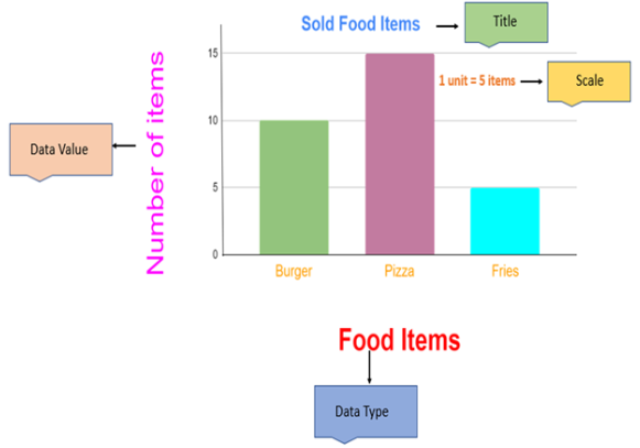
The graph below shows a bar graph of the number of food items that were sold in the shop.

Properties of Bar graphs
- All the bar must be equally spaced.
- The height of the bar represents the data value.
- The bar graphs must have a title, labels and scales.
- The data value must always start with 0.
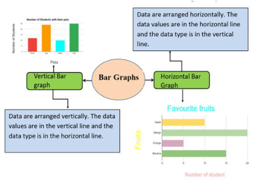
Types of Bar graphs
- Horizontal bar graph
- Vertical bar graph
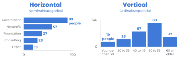
1) Horizontal Bar Graphs
- The data are arranged horizontally.
- In this graph the data type is in the vertical line and the data value is in the horizontal line.
- The bar runs from left to right.
2) Vertical Bar graphs
- The data are arranged vertically.
- In this graph the data type is in the horizontal line and the data value is in the vertical line.
- The bar runs from down to up.
Want to know more about how to use bar graphs better? Click here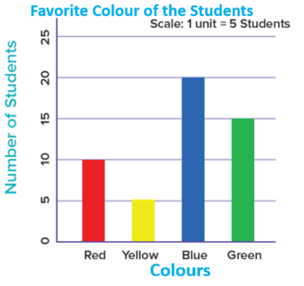
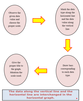
Steps to draw Vertical Bar graphs
- Observe the given data value and choose the proper scale.
- Mark the data type along the horizontal line and the data value along the vertical line.
- Give the proper title to the graph. Mention the scale used.
- Draw bars corresponding to each data type.
How to interpret the Bar Graphs
- The title of the bar graph tells us what the data is about.
- The horizontal lines and the vertical lines represent the data type and the data value respectively.
- The horizontal bar graph below shows the graph of the favorite fruits of the group of students.
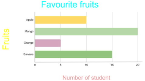
From the graph it can be visualized that:
-
The bar representing the mango is the longest bar.
Therefore, most of the students like Mango.
-
The representing the orange is the shortest bar. Therefore, the least liked fruit is Orange.
-
The scale of the graph is: 1 unit = 5 students.
-
10 students liked Apple.
-
20 students liked Mango.
-
5 students liked Orange.
-
15 students like Banana.
Bar graph for students’ practice:
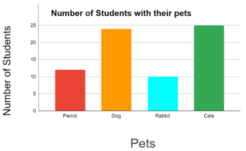
Given below is the data on the number of students with their pets.
|
Pets |
Number of Students |
|
Parrot |
12 |
|
Dog |
24 |
|
Rabbit |
10 |
|
Cats |
25 |
Draw a vertical bar that represents the given information and answer the following question:
-
Which pet is kept by the maximum number of students?
-
Which pet is kept by least number of students?
Solution:
The vertical bar graph is:
-
The graph shows that the maximum number of students liked cats.
-
The graph shows that the minimum students liked rabbits.
Here's an example of a Bar Graph for students
Favorite Candy of Students in Grade 4
The bar graph below shows the number of students who chose their favorite Candy out of four options: Green apple, Caramel, Butterscotch, and Banana.
- X-axis (horizontal): Represents the different candy flavors – Green Apple, Caramel, Butterscotch, and Banana.
- Y-axis (vertical): Indicates the number of students, with a range from 0 to 14.
Number of Students:
Data Shown:
- Green apple: 4 Students chose
- Caramel: 10 students chose
- Butterscotch: 7 students chose
- Banana: 8 students chose
Questions:
-
Which candy flavor do most students like?
-
How many students like Butterscotch?
-
What is the difference between the number of students who like Caramel and Green Apple?
-
Which flavor has fewer votes than Banana but more than Green Apple?
-
How many students like either Caramel or Banana?
A bar graph is a simple way to show information. Each bar's height or length shows how many items are in that group. In this example, the graph shows the number of students who like each candy flavor.
Play this fun online game on Bar Charts
Real-life examples of Bar Graphs:
1. Snacks Survey
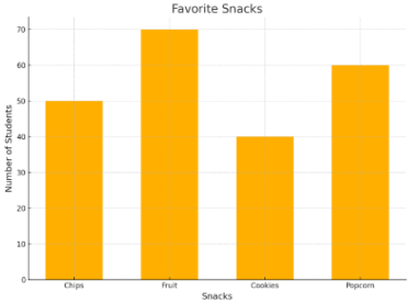
A bar graph showing the results of a survey about favorite snacks like chips, fruit, cookies, and popcorn. Each bar shows how many students chose each snack.
2. Weather Data
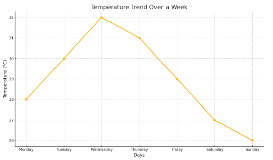
A bar chart showing the average temperature for each day of the week, helps students see weather trends.
3. Weekly budget comparison
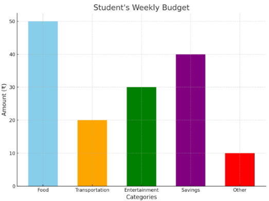
A bar graph showing how much weekly budget each student gets, with each bar representing a student and their spending on each categories.
4. Sports Scores
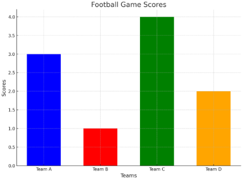
A bar graph showing the scores of sports teams in a tournament. Each bar represents a team and their total points.
5. Library Books
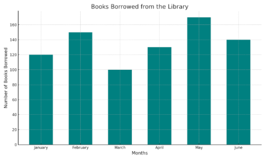
A bar graph can show how many books were borrowed from the school library each month. Each bar represents a month and the number of books borrowed.
Orchid's Video:
Orchid's learning material
Click the button to download the e-book
FAQs:
1. What is the purpose of a bar graph?
A bar graph helps show information quickly and clearly. Each bar shows the value of a category. The vertical line on the side of the graph is called the y-axis. The horizontal line is called is called the x-axis.
2. What are simple bar graphs used for?
Simple bar graphs show data for one category and are great for comparing different items. They make it easy to see and understand data at a glance.
3. What does every bar graph need?
Every bar graph has an x-axis and a y-axis. The x-axis usually runs horizontally and shows the categories or time periods being compared, while the y-axis shows the values. Sometimes, bar graphs are flipped, and the bars go sideways.
4. How are bar graphs used in real life?
Bar graphs are used to compare data in everyday situations. They are common in business, finance, and other areas. For example, a bar graph can show how much of each type of food is sold in a restaurant.
Things you have learned!
- Identify and understand the parts of a bar graph.
- Read and compare data by analyzing bar heights.
- Create a bar graph by organizing data and drawing bars accurately.
- Interpret real-life data using bar graphs for decision-making.
Numbers make sense when they're taught right. To see how Orchids The International School turns Maths from intimidating to intuitive, reach out to our admissions team.
Admissions Open for 2026-27
CBSE Schools In Popular Cities
- CBSE Schools in Bangalore
- CBSE Schools in Mumbai
- CBSE Schools in Pune
- CBSE Schools in Hyderabad
- CBSE Schools in Chennai
- CBSE Schools in Gurgaon
- CBSE Schools in Kolkata
- CBSE Schools in Indore
- CBSE Schools in Sonipat
- CBSE Schools in Delhi
- CBSE Schools in Rohtak
- CBSE Schools in Bhopal
- CBSE Schools in Aurangabad
- CBSE Schools in Jabalpur
- CBSE Schools in Jaipur
- CBSE Schools in Jodhpur
- CBSE Schools in Nagpur
- CBSE Schools in Ahmednagar
- CBSE School In Tumkur


Orchids The International School is one of India's leading chains of CBSE and ICSE schools, with 110+ schools across the country.