
Pictograph for Class 4 [+12 Practice Worksheets]
This is a comprehensive lesson plan for teaching pictograph to grade 4 students. The lesson is designed to make the concepts easy and engage students with activities like quizzes, practice questions, worksheets, visual aids like images and videos, and real-life examples.
Teachers can use this guide as a reference for delivering the concepts to students and engaging them in the classroom with the various questions and examples given in this page.
For parents, there are 12 downloadable practice worksheets that they can use for their kids.
Introduction: Pictograph
- A pictograph is the representation of a set of data using images or symbols.
- Each image or symbol should be of the same shape and size.
- Each image or symbol of the pictograph represents the frequency of the object in the set of data.
- A key is mentioned in the pictograph which tells us what the image or the symbols represents.
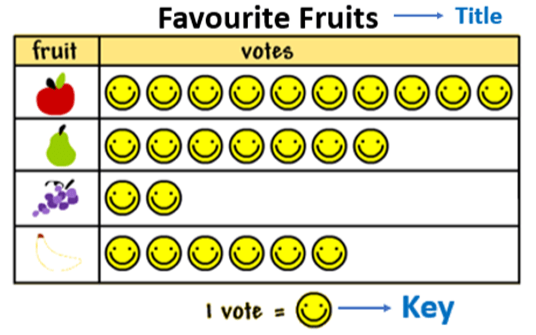
- Below are the pictograph images representing the favorite fruits of 30 students, showcasing their preferences in a clear, visual format.

How to Interpret the Pictograph?
- The title of the pictograph tells us what the data is about.
- The key represents the data value of each symbol or image.
- The pictograph image given below shows the data of the number of apples sold in 5 days.
- The fraction of a symbol or image can be used to represent the fraction of data value.
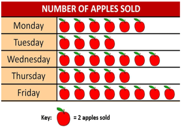
From the graph, it can be observed that:
- Maximum symbols of apples are on Friday. Therefore, a maximum number of apples were sold on Friday.
- The minimum symbols of apples are on Tuesday. Therefore, a minimum number of apples were sold on Tuesday.
- The key of the pictograph is: 1 symbol of apples = 2 apples sold.
- The number of symbols on Monday is 6.
Value of each symbol = 2 apples sold.
Therefore, the number of apples sold on Monday = 2 × 6 = 12 or it can be calculated by adding 2 six times, i.e.,
2 + 2 + 2 + 2 + 2 + 2 = 12 - The number of apples sold on other days can be calculated in a similar way.
Advantage of Pictograph
- It is easy to read and understand the data.
- For drawing a pictograph much information is not required.
- It requires only the information about the object and its frequency to construct a pictograph.
How to make a Pictograph?
These are the steps to be followed :
Steps to Make a Pictograph:
-
Collect Data:
-
Gather the data you want to represent.
-
Ensure the data is accurate and well-organized.
-
Decide on a Symbol:
-
Choose a symbol to represent your data (e.g., a star, a circle, or any relevant icon).
-
Determine the value of each symbol (e.g., one star equals five units).
-
Create a Key:
-
Provide a key that explains what each symbol represents.
-
Place the key at the bottom or side of the pictograph for reference.
-
Draw the Axes:
-
Label the horizontal axis (categories or groups).
-
Label the vertical axis (values or quantities).
-
Place the Symbols:
-
Arrange the symbols above the appropriate category.
-
Ensure the number of symbols corresponds to the data values.
-
Maintain Uniformity:
-
Use consistent spacing and size for the symbols.
-
Keep the pictograph visually clear and easy to read.
-
Add a Title:
-
Provide a title that describes the data represented in the pictograph.
-
Review and Verify:
-
Double-check the data and the number of symbols used.
-
Ensure the pictograph is accurate and visually appealing.
-
Enhance the Presentation (Optional):
-
Use colors to differentiate categories or groups.
-
Add creative elements to make the pictograph engaging while keeping it professional.
Pictograph Example:
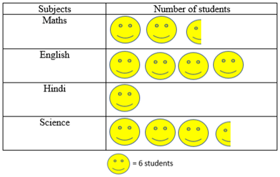
Given below is the data of the favorite subjects of the group of students.
|
Subjects |
Number of Students |
|
Maths |
15 |
|
English |
24 |
|
Hindi |
6 |
|
Science |
21 |
Practice:
Draw a pictograph to represent the data and answer the following question:
-
Which subject is liked by the maximum number of students?
-
Which subject is liked by the least number of students?
-
How many more students like science than Maths?
Solution:
The pictograph is:
-
The graph shows that the maximum number of students liked English.
-
The graph shows that Hindi is liked by the least number of students.
-
Number of students who liked Science = 21
Number of students who liked Math = 15
Subtract 15 from 21 to get the difference.
21 – 15 = 6
Therefore, 6 more students liked Science than Maths.
FAQs
1. What is a Pictograph Chart?
A pictograph chart uses pictures or symbols to represent data. Each picture shows a certain number, as explained in the key.
2. What type of data is used for a pictograph?
A pictograph shows data using pictures or symbols. Each picture stands for a specific amount, making it easy to understand and compare information.
3. What is the purpose of pictographs?
Pictographs use pictures to display data. They are simple to understand but may not show exact numbers clearly, so they need to be used carefully.
4. What is the main advantage of a pictograph?
Pictographs are easy to read and make large amounts of information simple to understand. They show data at a glance and are easy for everyone to follow.
5. What is an example of a pictograph?
For example, one apple icon might represent 10 apples bought. This helps you quickly see which items are more popular without reading long lists of numbers.
6. Why use a pictograph?
Pictographs help young learners connect objects with numbers. They make data visually interesting, easy to understand, and great for showing large amounts of information.
Orchids' learning material
Click the button to download the e-book
Numbers make sense when they're taught right. To see how Orchids The International School turns Maths from intimidating to intuitive, reach out to our admissions team.
Admissions Open for 2026-27
What type of concept pages would you prefer?
CBSE Schools In Popular Cities
- CBSE Schools in Bangalore
- CBSE Schools in Mumbai
- CBSE Schools in Pune
- CBSE Schools in Hyderabad
- CBSE Schools in Chennai
- CBSE Schools in Gurgaon
- CBSE Schools in Kolkata
- CBSE Schools in Indore
- CBSE Schools in Sonipat
- CBSE Schools in Delhi
- CBSE Schools in Rohtak
- CBSE Schools in Bhopal
- CBSE Schools in Aurangabad
- CBSE Schools in Jabalpur
- CBSE Schools in Jaipur
- CBSE Schools in Jodhpur
- CBSE Schools in Nagpur
- CBSE Schools in Ahmednagar
- CBSE School In Tumkur


Orchids The International School is one of India's leading chains of CBSE and ICSE schools, with 130+ schools across the country.