
Class 9 - Histogram: Definition, Graph & Solved Examples
A histogram is a way of graphically representing the distribution of numerical data. It organizes data into intervals and represents the frequency of data points in each interval using adjacent bars. A histogram helps to analyse big datasets into an understandable visual format. In a histogram, the continuous data is displayed through each bar that denotes a range of values. It is opposite to a bar graph which represents catagorical data. While they both look similar as they use vertical bars to represent data but they are fundamentally different. Let's understand in detail about the graphical representation of data using histogram and how are they different from bar graphs.
Table of Contents
- What is a Histogram
- How to Draw a Histogram
- Solved Examples on Histogram
- Practice Questions on Histogram
- Frequently Asked Questions

What is a Histogram
Histograms is a graphical representation of a grouped frequency distribution with continuous classes. Also, unlike a bar graph, the width of the bar plays a significant role in its construction.
Know more about related topics:
How to Draw a Histogram
Understanding what a histogram is and how to define it leads to a clear process that produces an easy-to-understand histogram graph.
Use these steps to create a histogram:
1. Gather and prepare the data: Compile numerical observations, either continuous or discrete.
2. Define the range and the number of bins: Depending on the data spread, choose variable-width or uniform bin widths.
3. Count frequencies: Tally the number of observations that fit into each bin.
4. Draw bars: Mark bins on the horizontal axis of the histogram graph.
5. Plot frequency counts on the vertical axis.
6. Title and label axes: Give your chart a title, clearly label the axes with the appropriate units, and, if you want, annotate the bars with frequencies.
Solved Examples on Histogram
Example 1: Draw a histogram for following class interval with frequency:
Solution: Draw histogram with X-axis as the height intervals and Y-axis representing the frequency. Bars should be adjacent to show continuity
Interpretation: The distribution is fairly symmetric, peaking around the 150-154 and 165-169 ranges. This is a great example of histogram for school-level analysis.
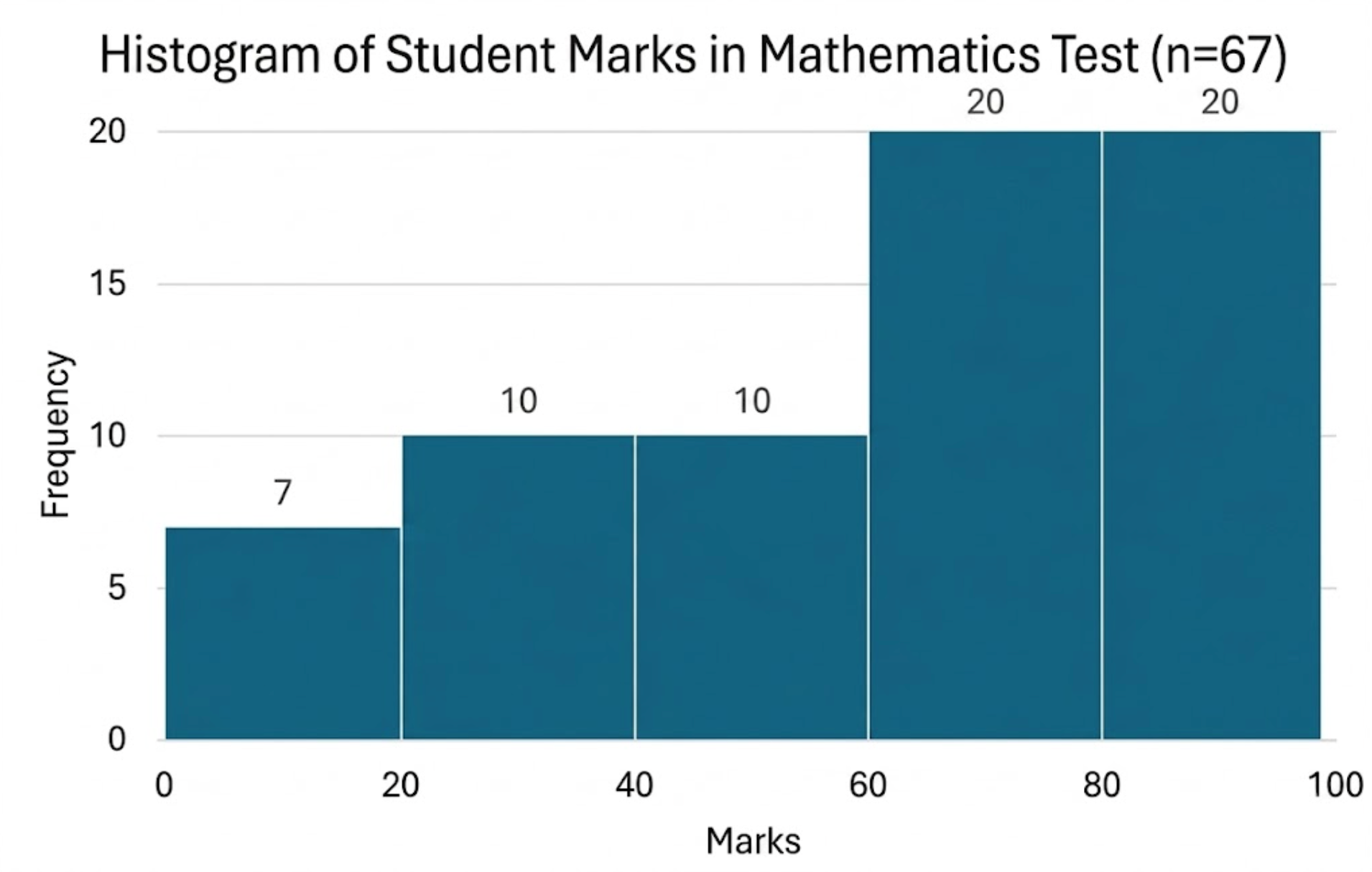
Example 2: A teacher wanted to analyse the performance of two sections of students in a mathematics test of 100 marks. Looking at their performances, she found that a few students got under 20 marks and a few got 70 marks or above. So she grouped them into intervals as: 0 - 20, 20 - 40, . . .,40 - 60, 60 - 80 and 80-100. Then she formed the following table:
Draw a histrogram for the given table.
Solution: Draw a histogram with X-axis as the marks interval and Y-axis representing the frequency. Bars should be adjacent to show continuity as:
Practice Questions on Histogram
- Plot histogram graph for the following table where X-axis represents the bill amount (₹) and Y-axis represents the number of houses
Draw bars without gaps between them
2. Draw histogram for the following data:
Numbers make sense when they're taught right. To see how Orchids The International School turns Maths from intimidating to intuitive, reach out to our admissions team.
Frequently Asked Questions
1. What is a histogram?
A histogram is a graphical representation of data that organizes data into intervals and represents the frequency of data points in each interval using adjacent bars.
2. What is the difference between a histogram and bar graph?
Histogram analysis continuous data by grouping it into range while a bar graph analysis discrete catagorical data using seperate bars.
Related Links
Admissions Open for 2026-27
What type of concept pages would you prefer?
CBSE Schools In Popular Cities
- CBSE Schools in Bangalore
- CBSE Schools in Mumbai
- CBSE Schools in Pune
- CBSE Schools in Hyderabad
- CBSE Schools in Chennai
- CBSE Schools in Gurgaon
- CBSE Schools in Kolkata
- CBSE Schools in Indore
- CBSE Schools in Sonipat
- CBSE Schools in Delhi
- CBSE Schools in Rohtak
- CBSE Schools in Bhopal
- CBSE Schools in Aurangabad
- CBSE Schools in Jabalpur
- CBSE Schools in Jaipur
- CBSE Schools in Jodhpur
- CBSE Schools in Nagpur
- CBSE Schools in Ahmednagar
- CBSE School In Tumkur


Orchids The International School is one of India's leading chains of CBSE and ICSE schools, with 110+ schools across the country.