

Class 9 - Graphical Representation of Data
Learning graphical representation of data is important in mathematics. In previous classes we have learned to represent the data in tabular form. In this topic we will understand how to represent the same data using different types of graphs including bar graphs, histograms and frequency polygons. The pictorial or graphical representation of data makes it easier to understand and compare data. We will study the different types of graphical representations of data including the process to draw them with examples.
Table of Contents
- Representation of Data using Bar Graph
- Representation of Data using Histogram
- Representation of Data using Frequency Polygon
- Solved Examples on Graphs
- Frequently Asked Questions

Representation of Data Using Bar Graphs
Bar graph is a pictorial representation of data in which usually bars of uniform width are drawn with equal spacing between them on one axis (say, the x-axis), depicting the variable. The values of the variable are shown on the other axis (say, the y-axis) and the heights of the bars depend on the values of the variable. This height or length of each bar represents the value of that item. For example, if you ask the favorite subject of 30 students in class 9 and most students answer maths as their favourite subject then, the bar for subject maths will be highest.
Properties of a Bar Graph:
- A bar graph is used to compare the data across various categories.
- The X-axis represents the categories and the Y-axis dipicts the values or frequency.
- The width of each bar in a bar graph is the same.
- The height of each bar represnts the quantity or value of a category.
- The space between each bar remians constant.
- These bars can be drawn either horizontal or vertical.
Steps to Draw a Bar Graph:
1. First step is to gather the details from the raw data or tabular data that you need to represent through a bar graph by identifying the categories and their respective values.
2. Draw and label both the axes to represent categories using x-axis and their values using Y-axis numerically.
3. Start drawing bars of equal width for each category and make sure the height or length of each bar matches its value.
4. Write a clear title at the top of the graph.
Know more about related topics:
Representation of Data Using Histogram
Histograms is a graphical representation of a grouped frequency distribution with continuous classes. Also, unlike a bar graph, the width of the bar plays a significant role in its construction. For example: The histogram for the frequency distribution table, representing the weights of 36 students of a class is given below: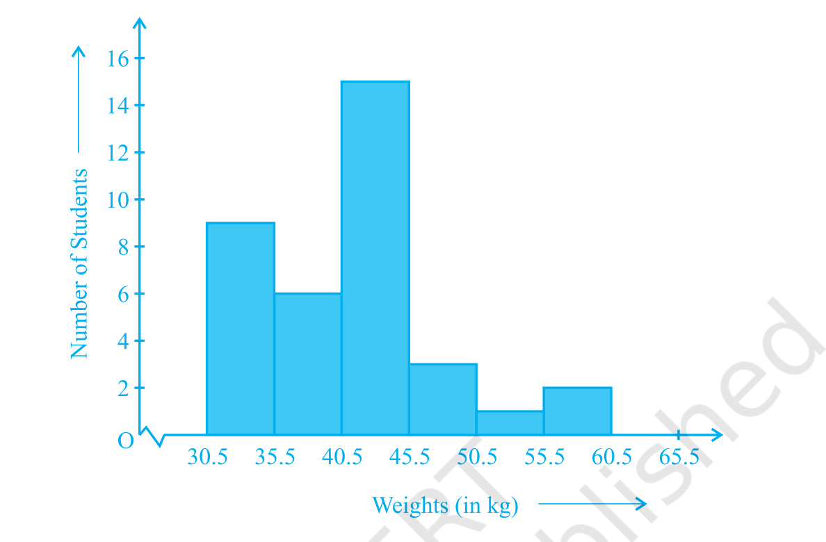
Steps to Draw a Bar Graph:
- Gather and prepare the data to compile numerical observations, either continuous or discrete.
- Define the range and the number of bins. Depending on the data spread, choose variable-width or uniform bin widths.
- Count frequencies: Tally the number of observations that fit into each bin.
- Draw bars Mark bins on the horizontal axis of the histogram graph.
- Plot frequency counts on the vertical axis. Title and label axes
- Give your chart a title, clearly label the axes with the appropriate units, and, if you want, annotate the bars with frequencies.
Representation of Data Using Frequency Polygon
There is another visual way of representing quantitative data and its frequencies. It is called a frequency polygon. A frequency polygon is a polygon created by joining the midpoints of each interval or bar on a histogram, i.e., the height of the points representing the frequencies of each interval.
Frequency polygons can also be drawn independently without drawing histograms. For this, we require the mid-points of the class-intervals used in the data. These mid-points of the class-intervals are called class-marks. To find the class-mark of a class interval, we find the sum of the upper limit and lower limit of a class and divide it by 2. Thus,
Class-mark = Upper limit + Lower limit/2
Solved Examples on Graphs
Example 1:
Draw a bar graph to represent the number of students studying in different classes. In which class there are the highest and the lowest number of students.
Solution:
Step 1: Identify the given data to be represented on the x-axis and y-axis of the bar graph.
Step 2: On the X-axis we will represent the class and on Y-axis we will represent number of students.
Step 3: Start drawing each bar to represent the students in each grade.
Step 4: The height of each bar corresponds to the mark.
Numbers make sense when they're taught right. To see how Orchids The International School turns Maths from intimidating to intuitive, reach out to our admissions team.
Frequently Asked Questions
1. What are the advantages of graphical representation of data?
Advantages of graphical representation of data:
- It helps us understand patterns, trends, and differences in data quickly.
- We can do comparative analysis for effective decisons making.
- It helps in estimating values properly without errors.
2. What is a bar graph and example?
A bar graph is a chart that uses rectangular bars to represent data. Each bar's length is proportional to the value it represents.
Related Links


Admissions Open for 2026-27
What type of concept pages would you prefer?
CBSE Schools In Popular Cities
- CBSE Schools in Bangalore
- CBSE Schools in Mumbai
- CBSE Schools in Pune
- CBSE Schools in Hyderabad
- CBSE Schools in Chennai
- CBSE Schools in Gurgaon
- CBSE Schools in Kolkata
- CBSE Schools in Indore
- CBSE Schools in Sonipat
- CBSE Schools in Delhi
- CBSE Schools in Rohtak
- CBSE Schools in Bhopal
- CBSE Schools in Aurangabad
- CBSE Schools in Jabalpur
- CBSE Schools in Jaipur
- CBSE Schools in Jodhpur
- CBSE Schools in Nagpur
- CBSE Schools in Ahmednagar
- CBSE School In Tumkur











Orchids The International School is one of India's leading chains of CBSE and ICSE schools, with 110+ schools across the country.