
Pictographs for grade 4 with examples
-
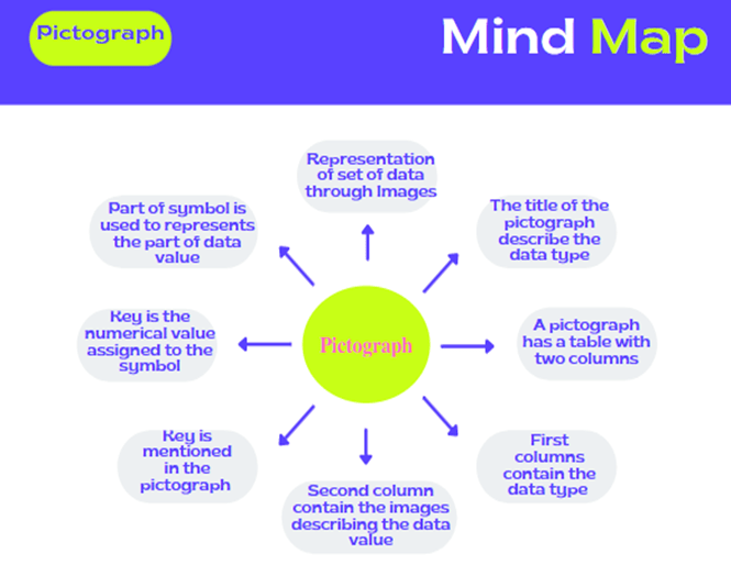
Pictograph is the representation of the set of data using images or symbols.
-
Each image or the symbol should be of same shape and size.
-
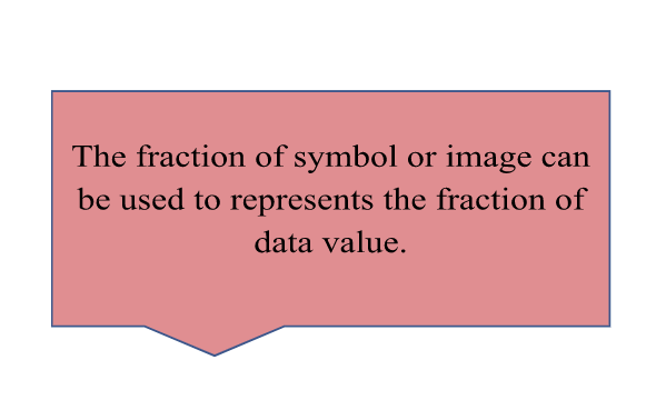
Each image or the symbol of the pictograph represents the frequency of the object in the set of data.
-
A key is mentioned in the pictograph which tell us what the image or the symbols represents.
-
Below are the pictograph images representing the favorite fruits of 30 students, showcasing their preferences in a clear, visual format.
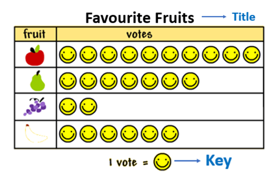
Interpret the Pictograph
-
The title of the pictograph tells us what the data is about.
-
The key represents the data value of each symbol or the images.
-
The pictograph image given below shows the data of the number of apples sold in 5 days.
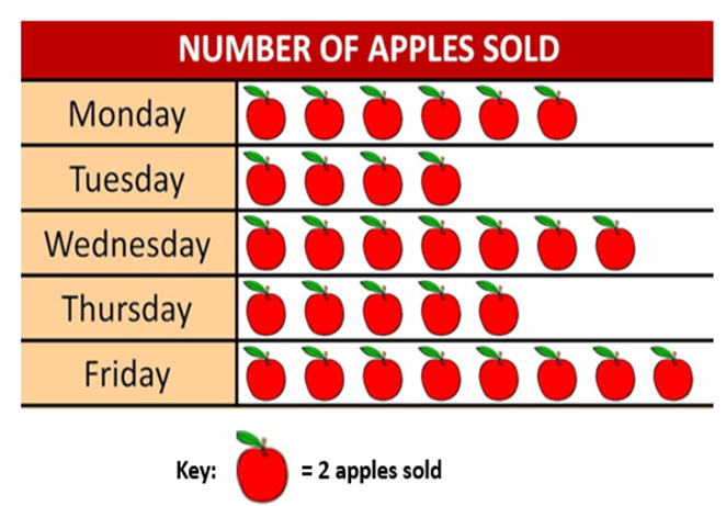
From the graph it can be observed that:
-
Maximum symbols of apples are on Friday. Therefore, maximum number of apples were sold on Friday.
-
Minimum symbols of apples are on Tuesday. Therefore, minimum number of apples were sold on Tuesday.
-
The key of the pictograph is: 1 symbol of apples = 2 apples sold.
-
Number of symbols on Monday are 6.
Value of each symbol = 2 apples sold.
Therefore, number of apples sold on Monday = 2 × 6 = 12 or it can be calculated by adding 2 six times, i.e.,
2 + 2 + 2 + 2 + 2 + 2 = 12 -
Number of apples sold on other days can be calculated in the similar way.
Advantage of Pictograph
-
It is easy to read and understand the data.
-
For drawing a pictograph much information is not required.
-
It requires only the information about the object and its frequency to construct a pictograph.
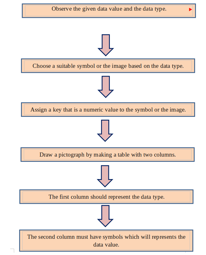
How to make a Pictograph?
These are the steps to be followed :
Pictograph Example:
Given below is the data of the favorite subjects of the group of students.
|
Subjects |
Number of Students |
|
Maths |
15 |
|
English |
24 |
|
Hindi |
6 |
|
Science |
21 |
Draw a pictograph to represent the data and answer the following question:
-
Which subject is liked by the maximum number of students?
-
Which subject is liked by least number of students?
-
How many more students like science than Maths?
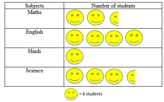
Solution:
The pictograph is:
-
The graph shows that the maximum number of students liked English.
-
The graph shows that Hindi is liked by the least number of students.
-
Number of students who liked Science = 21
Number of students who liked Math = 15
Subtract 15 from 21 to get the difference.
21 – 15 = 6
Therefore, 6 more students liked Science than Maths.
What is a Pictograph in maths?
Quizz:
The following pictograph shows the number of balloons liked by students.
How many orange balloons are liked by students ?
Take a look at the Pictograph given below:
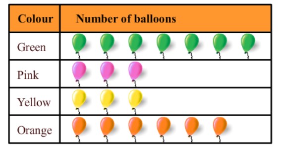
A .3
B. 7
C. 8
D. 6
Answer : d
The following pictograph shows the different modes of transport used by the students of a class to go to school.
How many boys use car to go to school?
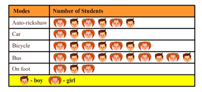
A. 2
B. 3
C. 8
D. 6
Answer : A
Real Life Pictograph Example :A simple real-life example of a pictograph for kids is showing **the number of toys each child has**. If each teddy bear picture represents 1 toy, the pictograph might look like this:
- 🧸🧸🧸 for Sam (3 toys)
- 🧸🧸 for Mia (2 toys)
- 🧸🧸🧸🧸 for Leo (4 toys)
- 🧸 for Ava (1 toy)
This pictograph helps kids see who has the most or fewest toys just by looking at the teddy bear pictures.
Good Questions to ask your kids:
- How many toys does Sam have according to the pictograph?
- Who has fewer toys, Mia or Leo?
- If each child gets one more toy, how many toys will Mia have then?

FAQs
What type of data is used for a pictograph?
In math, a pictograph (or pictogram) is a way to show data using pictures, icons, or symbols. Each picture or symbol represents a certain amount of data, making it easy to see how often something happens. This helps us quickly understand and compare information.
What is the purpose of pictographs?
A pictograph uses pictures to show data. However, it can be harder to see exact numbers with a pictograph, so it's important to use it carefully to avoid confusing or misleading information.
What is the main advantage of the pictograph?
Here are some key advantages of using pictographs: They make large amounts of information easy to understand. Pictographs are quick to read since all the data is shown at a glance, and they are widely understood without needing extra explanation.
What is a pictograph with an example?
A pictograph, also called a pictogram, shows data using pictures or symbols. Each picture can represent one or more items. For example, the table below shows how many refrigerators a seller sold each month from October to December.
Numbers make sense when they're taught right. To see how Orchids The International School turns Maths from intimidating to intuitive, reach out to our admissions team.
Related Links
Admissions Open for 2026-27
What type of concept pages would you prefer?
CBSE Schools In Popular Cities
- CBSE Schools in Bangalore
- CBSE Schools in Mumbai
- CBSE Schools in Pune
- CBSE Schools in Hyderabad
- CBSE Schools in Chennai
- CBSE Schools in Gurgaon
- CBSE Schools in Kolkata
- CBSE Schools in Indore
- CBSE Schools in Sonipat
- CBSE Schools in Delhi
- CBSE Schools in Rohtak
- CBSE Schools in Bhopal
- CBSE Schools in Aurangabad
- CBSE Schools in Jabalpur
- CBSE Schools in Jaipur
- CBSE Schools in Jodhpur
- CBSE Schools in Nagpur
- CBSE Schools in Ahmednagar
- CBSE School In Tumkur


Orchids The International School is one of India's leading chains of CBSE and ICSE schools, with 110+ schools across the country.